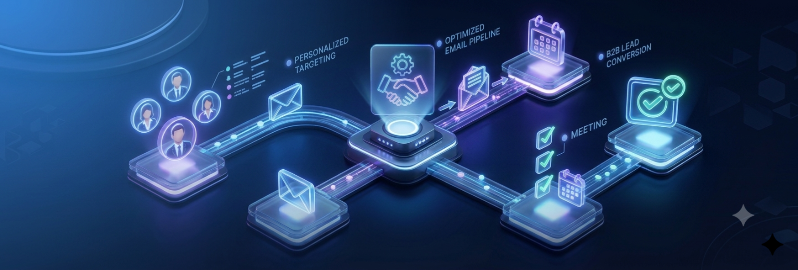
LinkedIn outreach for B2B sales teams is the process of identifying the right prospects, connecting with them directly on the platform, and moving them through a conversation toward a meeting — without relying on cold email or cold calling alone. Done well, it's one of the highest-leverage channels in B2B sales today: LinkedIn now drives the majority of B2B social-sourced leads, and the large majority of B2B buyers check a seller's profile before ever responding to outreach. Done poorly, it's the fastest way to get ignored, reported, or quietly blocked. This guide breaks the whole process into four measurable stages, with real benchmarks at each one, so you know exactly what to fix when something isn't working.
The Four-Stage Funnel Every LinkedIn Campaign Runs Through
Every LinkedIn outreach campaign moves through the same checkpoints, whether you're aware of them or not: connection acceptance → reply → positive reply → booked meeting. A weakness at any stage collapses everything after it, and — this is the part most teams get wrong — the fix for a weak stage is almost never "try harder at the next one." A high acceptance rate paired with a low reply rate is a messaging problem, not a targeting problem. A healthy reply rate paired with a low positive reply rate is a targeting problem, not a messaging one. Diagnosing which stage is actually broken is most of the work.
Stage 1: Getting the Connection Accepted
This is the gate everything else depends on, and it's also the most benchmarked, most argued-about number in LinkedIn outreach.
The real range: Across the largest available datasets — one analysis of over 13 million connection requests puts the platform-wide average at 28.5%; other benchmarking sources place "good" in the 30-45% range, with anything above 40% signaling that targeting and profile are both working, and anything sustained below 20-25% treated as a warning sign LinkedIn's own systems watch closely.
Why the platform average is the least useful number in any of these reports. Every large dataset breaks down sharply by industry: Staffing & Recruiting consistently outperforms at 30%+ acceptance, while sectors like Apparel, Telecommunications, and SaaS/Technology sit meaningfully lower. Benchmarking your SaaS campaign against a blended platform average that's pulled up by unrelated industries will make a genuinely on-target campaign look like it's underperforming. Compare against your own industry's range, not the headline number.
Seniority changes the math too. More senior titles accept at meaningfully lower rates than individual contributors — a VP or C-suite prospect is a harder accept than a manager or specialist, simply because they receive more outreach and have less time to evaluate it. If your ICP skews senior, a lower acceptance rate isn't automatically a sign something's broken.
What actually moves this number:
- A mutual connection or shared context lifts acceptance meaningfully — a warm signal (a shared group, a recent interaction, a mutual connection) consistently outperforms a fully cold request with no shared context at all.
- Pacing matters as much as targeting. LinkedIn's weekly connection ceiling isn't a hard published number — it's reputation-based, generally landing somewhere around 100-200 per week depending on account trust — but sustained drops in acceptance rate are exactly what trigger automatic throttling. Volume without targeting doesn't just waste requests, it actively damages the account's standing.
Stage 2: Getting a Reply
Once accepted, the next checkpoint is simple: did they respond at all?
Reply rate benchmarks vary more across sources than any other metric in this guide — some report averages as low as 3-4%, others report double-digit averages for well-run campaigns, with top performers reaching 25-50% through tight targeting and multi-touch sequencing. The spread itself is a signal: reply rate is the metric most sensitive to targeting quality, so a wide reported range across different tools and campaigns is expected, not a sign the data is unreliable.
The note question, settled with the largest available dataset. This is where sources genuinely disagree, so it's worth being precise about which claim to trust. One of the most rigorous studies available — over 20 million outreach attempts analyzed — found almost no difference in acceptance rate between requests sent with a personalized note versus none at all (26.42% with a note vs. 26.37% without, a gap within normal variance). What the note did move, substantially, was the reply rate after acceptance — nearly doubling from 5.44% without a note to 9.36% with one. The practical takeaway: don't expect a note to fix a low acceptance rate, because it won't. Expect it to matter once someone's already said yes.
The single most damaging mistake at this stage isn't a missing note — it's pitching immediately. A connection request immediately followed by a sales pitch is one of the most negatively received patterns in B2B outreach, and a bad first outreach experience tends to close the door permanently, not just for that campaign. The first message after acceptance should earn a reply, not attempt a close.
Multi-touch beats single-touch, consistently. Replies cluster around the second and third touch far more often than the first. A sequence that stops after one message is leaving most of its actual reply volume on the table.
Stage 3: Getting a Positive Reply
This is the checkpoint most campaigns never separate out — and it's the one that actually predicts pipeline.
Total reply rate and positive reply rate are different metrics, and conflating them causes real misdiagnosis. A "not interested, please remove me" is a reply. So is "who is this?" Neither moves a deal forward. A working benchmark for genuinely positive, interest-signaling replies sits in the low single digits of total sends for a well-targeted B2B campaign — a much smaller slice than total reply rate, and that's expected, not a red flag on its own.
If total replies look healthy but positive replies don't, the problem is almost always ICP precision, not messaging. The right volume of people are responding, but they're not the right people — which means tightening the target list typically moves the needle more than rewriting the message again.
Stage 4: Getting the Meeting Booked
The end-to-end number that actually matters for pipeline.
A working reference range is roughly 1-3% of total sends converting to a booked meeting — genuinely the hardest stage to benchmark cleanly, since it depends heavily on deal size, offer quality, and how fast a rep follows up on a positive signal, not just the outreach itself. A meeting-booked rate that's consistently below roughly half a percent is rarely a "LinkedIn problem" specifically — it's more often a targeting, messaging, follow-up-speed, or offer problem showing up at the last stage of the funnel, where it's easiest to notice and hardest to trace back.
Common Mistakes That Break the Funnel Early
- Treating the connection note as an acceptance lever — it isn't one, per the data above; save the effort for post-acceptance messaging instead
- Benchmarking against the platform average instead of your own industry and seniority mix — makes healthy campaigns look broken and broken campaigns look acceptable
- Pitching in the first message after connecting — the single fastest way to trigger the negative "pitch-slap" reaction that closes a door permanently
- Stopping after one message — most real reply volume comes from the second and third touch, not the first
- Optimizing message copy when the actual problem is targeting — a low positive reply rate specifically points at ICP precision, not phrasing
Where This Gets Hard to Do by Hand
Everything above is genuinely learnable and doable manually for a small volume of high-priority accounts. It breaks down at real B2B sales team scale, and it breaks down in a specific, predictable way: pacing gets inconsistent across multiple reps or accounts, the second and third follow-up touches are the first thing to get skipped when a week gets busy, and diagnosing which of the four funnel stages is actually underperforming requires pulling and cross-referencing numbers that usually live in different places.
This is the specific gap purpose-built LinkedIn outreach tools are meant to close — not by replacing judgment on targeting or message quality, but by handling the mechanical parts reliably: per-account pacing that respects real platform limits, sequences that branch based on whether someone actually replied rather than firing on a fixed timer, and analytics that break down acceptance, reply, and campaign performance without manual spreadsheet work. Outflo's Smart Sequences apply this directly — branching follow-up logic based on real prospect behavior, AI personalization pulled from a prospect's actual profile content rather than a static template, and per-account safety controls for teams running outreach across multiple LinkedIn accounts or reps at once.
Frequently Asked Questions
What is a good LinkedIn connection acceptance rate for B2B outreach? Roughly 30-45% is considered strong across most available benchmarks, though the right number to compare against is your specific industry and seniority mix, not the platform-wide average — some industries (Staffing & Recruiting) consistently run higher, others (SaaS, Apparel) consistently run lower, and senior titles accept at lower rates than individual contributors regardless of industry.
Does adding a note to a LinkedIn connection request improve results? It doesn't meaningfully change whether someone accepts — the largest available dataset shows acceptance rates essentially identical with or without a note. Where a note does help substantially is the reply rate after acceptance, which nearly doubles when a note is included versus a blank request.
How many follow-up messages should a LinkedIn outreach sequence include? More than one. Replies consistently cluster around the second and third touch rather than the first, and stopping after a single message leaves most of the realistic reply volume unclaimed.
What's a realistic LinkedIn outreach meeting-booked rate? Roughly 1-3% of total sends is a working reference range for B2B outreach, though this depends heavily on deal size and how quickly a rep follows up on a positive signal — the outreach itself is only part of what determines this number.
How do I know if my LinkedIn outreach problem is targeting or messaging? Compare total reply rate against positive reply rate specifically. A healthy total reply rate with a low positive reply rate points to targeting precision as the issue — the wrong people are responding — while a low total reply rate with reasonable acceptance points more toward messaging.
- *
- *
Want a LinkedIn outreach workflow that handles the pacing, sequencing, and analytics automatically? Start your free Outflo trial — no credit card required.
FAQ
Common questions
Q1: What is a good LinkedIn connection acceptance rate for B2B outreach?
A1: Roughly 30-45% is considered strong across most available benchmarks, though the right number to compare against is your specific industry and seniority mix, not the platform-wide average — some industries (Staffing & Recruiting) consistently run higher, others (SaaS, Apparel) consistently run lower, and senior titles accept at lower rates than individual contributors regardless of industry.
Q2: Does adding a note to a LinkedIn connection request improve results?
A2: It doesn't meaningfully change whether someone accepts — the largest available dataset shows acceptance rates essentially identical with or without a note. Where a note does help substantially is the reply rate after acceptance, which nearly doubles when a note is included versus a blank request.
Q4: What's a realistic LinkedIn outreach meeting-booked rate?
A4: Roughly 1-3% of total sends is a working reference range for B2B outreach, though this depends heavily on deal size and how quickly a rep follows up on a positive signal — the outreach itself is only part of what determines this number.